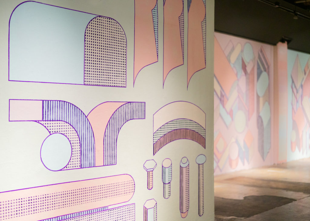
Andrew Scripter’s Instruction Manual for Giant Tents is an immersive mural inspired by Buckminster Fuller’s 1969 manifesto Operating Manual for Spaceship Earth. Each wall of the installation unfolds before a viewer like the pages of a gigantic how-to guide, deploying diagramatic composition, isotropic perspective, and architectural forms that trigger both a familiar intuition and a bizarre curiosity. In taffy pastel hues popped with deep purple lines and halftones, Scripter illustrates his meditations on the basic shapes and structures of society, exploring in panoramic visuals the systems theory and futurist impulses that defined Fuller’s oeuvre. While this is Scripter’s first foray into large-scale painting, his skill with geometric linework, vibrational perspective, and seductive color palettes are emboldened here, clearly honed from years of prolific print practice.
Where were you born and raised?
I was born in Springfield Massachusetts, and grew up in West Springfield, a suburb of the city. It is a city that has been struggling for my entire life and I am always observing it from a distance.
It feels like there is a timeline of how a city is built and how it’s structured. If it fails enough, it gets to a certain point of disarray that city officials take big, bold, and sometimes wrong steps to make it better. That’s where it feels like it’s at right now and has been for decades.The big thing right now is that- either the city or the state allowed MGM to open a casino there. To me it feels like scraping the “bottom of the barrel” of solutions to make the place better. It could go either way- it could encourage economic growth or it could encourage so much more distress. Western Mass seems super divided with that.
I went to a community college that was built around the Springfield Armory (where the US military’s guns were produced for about 200 years). It is a beautiful but bizarre compound right in the middle of Springfield.
After community College you went to MassArt for your BFA, how did you start out there?
I didn’t go right into printmaking at first. The few things you can find online about me are actually from when I was in illustration and graphic design in Mass Art. I was encouraged by teachers to go into graphic design for some financial stability and a career path. I definitely have always been interested in more of the DIY and homegrown quality of artistic projects, built mostly around bands.
I figured out screenprinting when I was in high school. I had some cool art teachers that were encouraging. I am still in touch with some of them. But outside of that, I had friends who were in bands and I wanted to make them t-shirts. There wasn’t alot online or available supplies at the time, so trying to figure out screenprinting was difficult, I was taking window sheer material and stretching it over the top of old window frames and using modge podge to fill in some holes. I found out about emulsion and got Speedball emulsion that was a game changer.
I stopped doing it when I went to college but I knew I would come back to it. I was making original designs for bands as a teenager and it really tweaked my brain. I remember trying to figure out two-color screen prints- I had this cooky Jack Nicholson image and some text I wanted overlaid on it- some big bold text. I had text in both layers for this design and I didn’t get the registration perfect- but it looked like a cast shadow. I didn’t know what I was doing and it wasn’t what I was intending, but it was like 400 times cooler. It was super late at night in my parents basement and I was just like “WHOA!!”. My mind was blown. That was the point where my brain just got re-wired.
Etching was my first print class while I was still technically an illustration major. After taking that class I think it solidified my interests in transferring over to be a BFA printmaking major. Print was a really small department at the time and was sorta separate from the rest of the school (Massarts printshop is an old latin school basketball gym, one of the biggest on the east coast). There would be critiques and stuff, but you could really do whatever you wanted. There was lots of installation print work, and they also had a master printer program. MASSArt would hire a mid-career artist to come in and do a limited edition print with their master printer and the class, and the school could sell one of the prints at auction for an annual fundraiser. The artist who was there when I first got involved was Trenton Doyle Hancock. Last year TDH had a huge retrospective at MASS MOCA.
Was that the first time you had seen that model with printmaking- the potential to have a shop or studio and what it takes to help an artist print their work.?
It put into perspective the amount of patience and understanding of the process it needs, all the work to set up something. It’s not necessarily giving them an etching plate and letting them scratch away at it until they get something. If they want to do it correctly, a Master Printer would be there to help them best approach translating the work. That was cool to see. A lot of times it would be a lot of mixing processes, so four-color etching, or one-color etching, a couple woodblock prints, and finishing it off with a silkscreen layer.
There’s such generosity in that, it’s such a service.
Definitely. With MassArt’s print shop, I don’t know if a lot of people outside MassArt knew about it, but they had a reputation for being extra hard workers. They were all pretty intense. I remember when I was touring MassArt and thinking ‘I don’t know if I want to do that’. When you walk through the space it’s a converted basketball gym and it’s got partitions for all the different departments and studio spaces. Because the department’s so small, all the people are always there, so it seems like they rule the space. They had this guitar amp they would pump music through, it was stacked on top of a bunch of shelves, and they would play black metal and all the people working there at the time were long haired dudes walking around staring at you, it was very intense. There was something about that like, ‘holy shit these guys are into what they’re doing’. At least from a prospective student going on tours it felt like a really cool major or something.
When did you move to Maine?
I graduated from MassArt and moved up to Maine soon after I graduated because Boston is pretty expensive and there weren’t really any jobs I was gunning for, I wasn’t really sure of what direction I was going to go, but Maine felt like a nice change of pace. I knew that I could finance a studio space through screen printing, so at that time I bought some screen printing equipment and was planning on just doing what I did before going to college which was just work with bands. “I’ll print your shirts and that will be my rent money” in a lot of ways it’s still like that but with riso. I did that for a little while in 2014, and my studio space was at Base Camp Studio. I really lucked out because that space was set up by artists Will Sears and Tessa O’Brien. I lucked out immediately by meeting Will, he was really welcoming and kinda got me a job at the place he does design work for, Oxbow brewing. The studio rent was pretty affordable. I stayed at that space for four or five years. That’s where I started Wing Club. The earlier version was in Boston. We called it ‘BCWN’ which was ‘Boys Club Wing Night’. After every critique we’d go to this really bad bar that had ten cent wings, looking back I’m like holy cow, It was disgusting.we started making collaborative art pieces and a few zines together. The whole idea of wing night, we took those words and changed them around so it was like ‘Wing Boy Night Club’, and then it became BCWN, there’s a few zines floating around with that name. When we were graduating, we had to move out of our studio space and had accumulated all this random stuff and we put it all in this one thing just to clear out our studios. That was really fun. For school we were allowed to go to the Southern Graphics Council (SGCI), it was in San Francisco that year which I was extremely excited about because at that time San Francisco was booming with artists. There were a lot of really exciting things, not just artists, musicians too that were really doing great stuff. I thought, even if we don’t go to the SGC which would be printmaker heavy stuff, at the time I liked the idea of doing printmaking as a form of making multiples, but not as a master print process. There’s a couple trains of thought when it comes to that craftsmanship. But I like the multiples element of it. But I knew going into the SGC it was not going to be that, but I felt like, any reason to go to San Francisco and meet people.
Were there specific bands or artists you were trying to see?
Yeah tons. At the time, Fecal Face was still open, it was a website that used to host a lot of blog posts and interviews. They would highlight some awesome artists that are still really popular today, even more popular than they were back then. The garage rock scene was really big then, the Oh Sees, a decent noise band community back then that I was really into, like CCR Head Cleaner. I wanted to go to some galleries, Ever Gold Gallery, Fecal Face Gallery. The big thing was there was a tattoo artist Paul Urich, he had a gallery at the time called Nowheresville. I really wanted to meet him because he started in fine art and moved into folk art, and then got into tattooing after that which is a weird route to go, a lot of times people just jump straight into tattoo and that’s what they do forever. I knew that he had an appreciation for art more geared to his aesthetic than traditional tattooing. When we went, I brought a copper plate that had hard ground on it and said, ‘you should take a tattoo machine and stipple with it on the etching plate or just make a design and send it to me, and we’ll print it for you.’ It was a nice little postcard size. He said ‘oh sure!’ and scratched it and sent it to me and we printed it. If you look at and edition print there’s always a watermark at the bottom of the print that specifies where is was produced. When printing Pauls Etching we thought ‘we should call it something, we should have a watermark, it’s just two of us’, Jimmy Viera and I, who lives in Portland now, ‘two out of the five people or whatever, let’s call it Wing Club’ and that’s where the name came from. When I moved up here, I needed something to have as my name. At first, I was not super drawn to it because I don’t want people thinking of somebody with chicken wing fingers working on their t-shirts, making stuff and thinking there’s going to be barbecue sauce all over it. That was my first thought. I’ve gotten to a point where I’m fine with it. Every once in a while, I get people who are like ‘Wing, right?’ thinking that’s my name, I’m like ‘I wish’.
What was your first collaborative project with SPACE, was it the first New England Art Book Fair (NEABF)?
My first collaborative project was the NEABF, but there might have been a poster that I made before that. SPACE had a show called The Body come perform, I think I made something for that. I did two, one of them wasn’t really circulated, but the second one I screen printed so there’s probably one floating around here. I think I probably cold-called you guys to get started. That was one thing that I really am thankful for with Wing Club, it gave me a moniker to feel comfortable with talking to people. The first person I talked to in the music world in Maine was a guy that I remember seeing a few times in Boston, Matt LaJoie, he’s in a band called HerbCraft, I remember seeing them in Boston a bunch. Now him and his partner run Flower Room Records. They’ve done DJ sets here a couple times, Ash and Herb, they did Peppermint Twist for Valentine’s Day here. I reached out to Matt when I first moved to Maine and said ‘Hey I just moved to Maine, I remember seeing you at Whitehaus in Boston, I really love what you guys do, if you ever need any graphic design or want a poster printed let me know’. I think I hit him up at the right time because they were about to release a new album and then they were going on tour, they needed posters for the tour’, that was the first project which was really great because it was so welcoming and easy to do. I didn’t get paid but that’s how it goes. I was excited to do it because he was someone whose music I appreciated, coming from the same mindset of music making and art making.
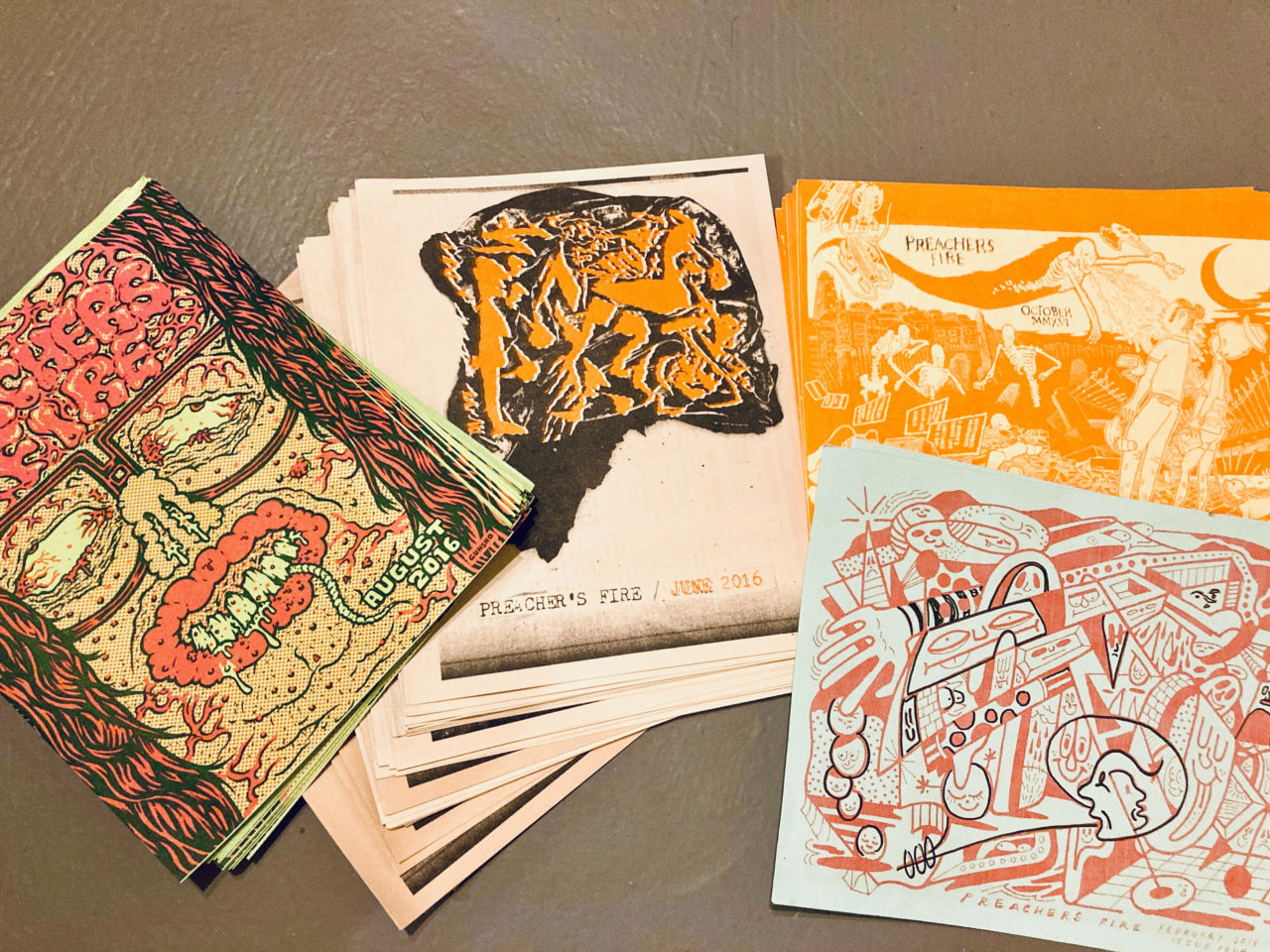
Let’s talk about Preacher’s Fire
When I first moved to Maine, I met a guy named Jon Morris (Last Mercy Emissions) who was doing basement shows at the time, things that weren’t directly related to bigger venues at the time, and was trying his best to promote these small events but hitting a wall with publications highlighting them. Him and I became pretty good friends immediately because we both worked the night shift together at a printshop, and it was just him and I. He was getting pretty frustrated with the lack of routes to promote his performances and the things he was booking. I was really interested in doing something I’d seen in other cities. In Boston there’s The Boston Compass, it’s run by another 501c down there called Brain Arts. Every month they put out a full-size newspaper with shows, basement shows, they wouldn’t say the exact address. They would also have other things like articles about bands that you might not have known about from Boston. Boston has a pretty big history of underground music. It’s a cool thing whenever you’re out and about to grab the most recent issue. Down in New York there was another called Showpaper, which was literally one sheet of paper, tabloid sized, they were doing it once or twice a month, we definitely wanted to make something simple like this that you could take on a fridge.
To me, these small indie newspapers/event calendars felt like a very cool collectable thing. Not only that you could see all the events that were happening, but that you’d have some fine art you could tack onto a wall. That was the idea when we first were thinking of Preacher’s Fire. I had just gotten a riso so I could crank stuff out if I really wanted to. There’s plenty of artists in town that would be stoked to do cover art. Our mindset was to promote all of the folks we knew who were doing really amazing work and hope to highlight out little corner of the north east with this little riso printed flyer.
In the end, we did 24 issues, once a month for about 2 years and I really miss it honestly. It was a great way for me to keep in touch with what people were doing in Maine, artwise, and maybe help encourage artists friends I know searching for an outlet.
You have shared that Buckminster Fuller is a major influence on you- through his design and general philosophy? He was a futurist and an environmentalist. His early articulation of sustainability in a really holistic and synergistic way- affordable housing, ecological destruction, transportation, education, poverty. Can you talk more about what you draw from him? The title for your installation Instruction Manual for Giant Tents comes from a Buckminster Fuller book, right?
Yes it’s loosely based on the book Operating Manual for Spaceship Earth. My understanding of it is that it’s a look into the origins into how we set up our society. The routes we went to make the society we currently live in today (or at least how it was when bucky was writing this in the 60s). It laid out things, environmental issues, general systems theory, things that of his time were very radical and not talked about. It can be a little goofy how he describes things at times but I really like it.
That was a jumping off point for me – my artwork tends to gravitate toward my interest in the mundane little structures we use in our day to day life, like signage instruction booklets, or even just little doodles that I find have some impact for one reason or another. How Bucky used the idea of an “operating manual” to run through the big questions he had about our society kinda made me laugh. I wanted to mimic that by approaching it like an Ikea instruction manual or something.
There is only one real Buckmister fuller reference in the whole installation, it’s The hexagon [in the mural] which is based on the Dymaxion house, he [Buckminster Fuller] proposed the idea of low income housing, structures that were efficient but utilized the least amount of space possible. It never took off, it was a World’s Fair project. I think he also made a Dymaxion car with it, it was 35 miles to the gallon, which at the time was crazy. But nobody paid attention because gas was so cheap.
The formal aesthetics and philosophy of Buckminster Fuller’s architecture work is evident but there’s also his structuralist philosophy of zooming out and the idea that you can’t talk about people or an event without talking about all of the interlocking systems that create it.
Absolutely, one thing he mentions in a chapter is that we can’t predict more than 25 years out. There is tons of evidence throughout time that everything is cyclical.
I want to ask about how you’re integrating advocacy into your art practice. I’ve seen on Wing Club that you’re raising money for other artist collectives, selling prints for other artist collectives. Is that how you’re trying to move through the world now as an artist? Instead of art being a career or art being a therapy, art being a community good?
Within the past year or two I have reevaluated how I want to do things. Especially within the art world. How can I take that and utilize it towards something that needs help? At the beginning of COVID, and still very much now, it was unclear when these spaces like Pickwick Press upstairs would be back in full swing, if they’re ever going to be back to that state. Any help those kinds of spaces could use, I think they serve a really important service within the community. That’s what makes Portland exciting to people. There’s a lot of people that want those spaces to exist. If they don’t, that would be devastating.
I was wondering what it was like for you to do this large scale mural that is reflecting on large scale housing, while there’s a major housing protest happening down the street.
It’s been interesting, I’ve walked by [the encampment] a handful of times while I was working on this and I’ve seen it flourish which is really interesting. When I set this up I wasn’t thinking about it as a prominent issue at the time.
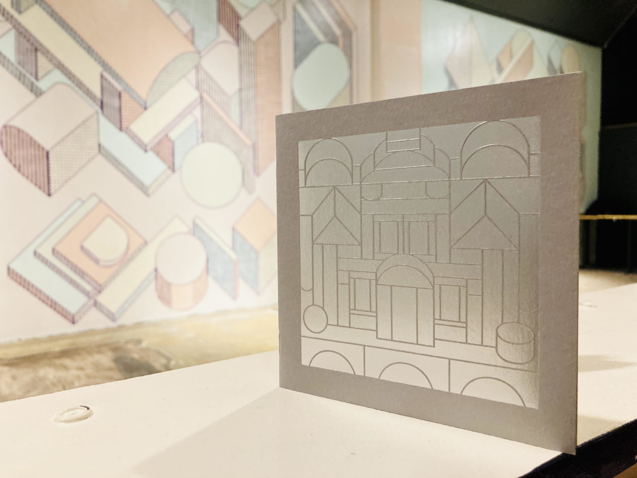
You have also created a limited edition zine to accompany this exhibit benefiting Maine People’s Housing Coalition (@phc_me).
Yeah! Is sorta a companion piece to the installation. Its riso printed with a silver foil printed cover by Laura Marr Press in Westbrook. 100% of the Proceeds go to the Portland Housing Coalition too. (Available for purchase at SPACE Gallery).
Anything else you want to share?
The New England Art Book Fair! That was probably the first big project I did with SPACE Gallery. We hope to have them again someday, but the event used to take place in October every year and would bring in about 35 vendors of zine and artbook publishers from around the country through Maine. It was always a great time and was always so exciting to see local folks prepping to make new work for the event. Someday we’ll have another!
COVER: Andrew Scripter’s Instruction Manual for Giant Tents, Installation View at SPACE Gallery, 2021. Photo by Joel Tsui. All poster images courtesy of Andrew Scripter.
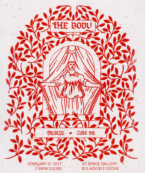
The Body poster by Andrew Scripter & Dylan Hausthor for SPACE 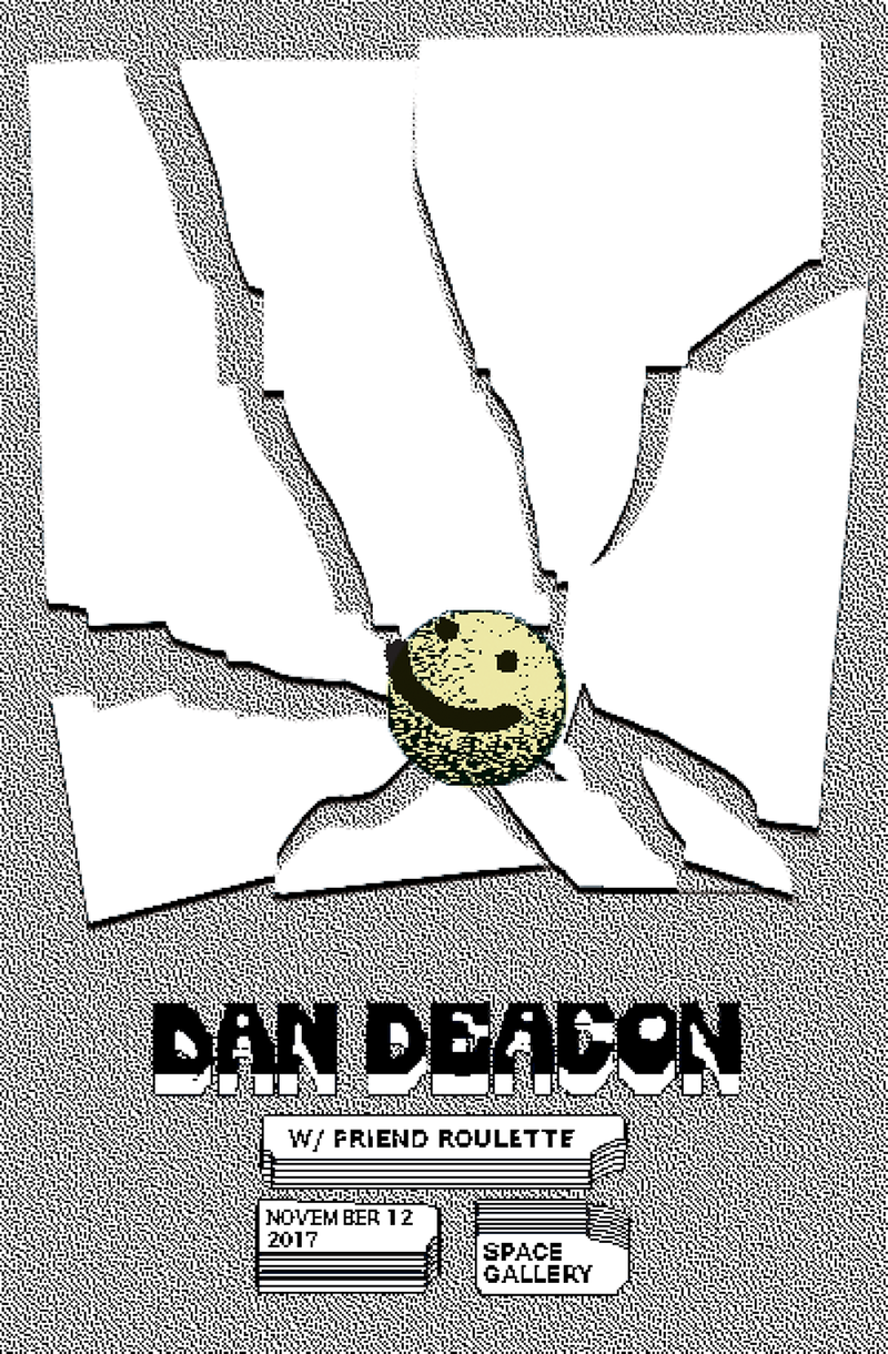
Dan Deacon poster by Andrew Scripter for SPACE 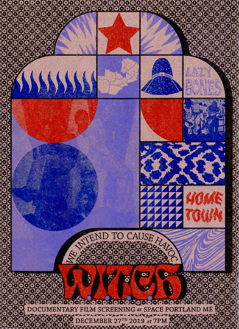
W.I.T.C.H. poster by Andrew Scripter for SPACE 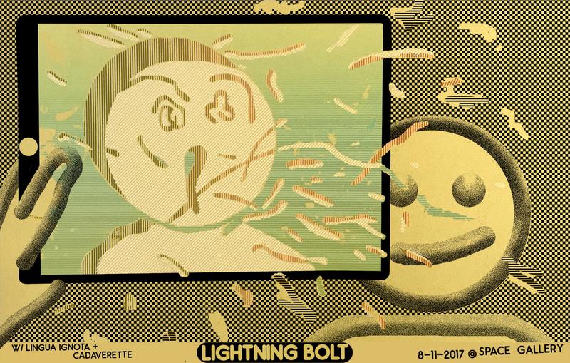
Lightning Bolt poster by Andrew Scripter for SPACE