On the heels of our wildly successful Johnny Cash Night in ’09, The Nave Gallery,Band In Boston, Rhode Island School of Design, and Space Gallery have organized a series of Johnny Cash tributes New England-wide to benefit prison book programs and celebrate the Man in Black. Join us for an evening of tribute covers by Portland musicians Christopher Teret, Jesse Pilgrim and the Bonfire (with many special guests!), and Caleb Aaron and the Thrill Pills, spanning the entirety of Cash’s discography from Sun Records-era barn burners to gospel tear-jerkers. Proceeds from this event will benefit Volunteers for Hancock Jail Residents, which has operated a jail library program since 2001 and also purchases books for Maine’s prisoners as funds allow. More info at www.jailvolunteers.org.
This poster was created by Michael Dacey at Repeat Press Somerville, MA. who you might recognize from a recent solo show at Corduroy Boutique in town. Michael will have these posters for sale at the Johnny Cash night April 28th, so please stop by and grab one while you can! The rest of this post is taken from Michael’s Repeat Press Blog.
I was approached by the Nave Gallery to create a poster for the concert series accompanying their upcoming art show, “The Beast In Me” – art inspired by the work of Johnny Cash. Jenn from the Nave worked tirelessly to coordinate a 4-city tribute series of bands playing Cash songs, all in benefit for prison literacy programs.
These posters will be available at all four concerts, as well as through the Nave Gallery. A portion of proceeds will go to the same prison book programs affiliated with the concert series.
I’ll be manning the sales table at each show so be sure to stop by and say hello if you’re able to make it out! full schedule here.
Started things off with a loose sketch at full size – I had just picked up some linoleum and was eager to put it to use as I hadn’t carved anything by hand in years, so I decided that the main element would be curved text cut from linoleum.

More process shots after the jump!
Then started working out the main text onto the linoleum block. You can see in the picture that I almost forgot to lay things out backwards. Total pro.

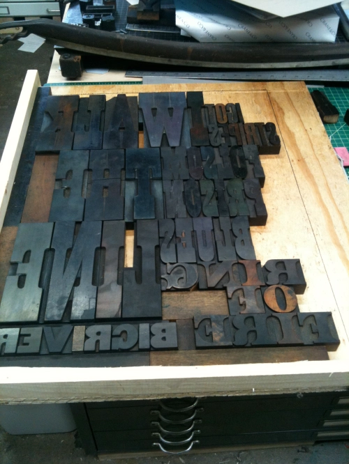
Text drawn out (backwards!) with some wood type for reference:

Starting to carve into the linoleum. I purchase it in large sheets that get cut down and mounted to wood for printing. You can also see an outline of an ornamental shape I was considering drawn out there that I decided not to use in the final design.

Fully outlined.

All negative area carved away, trimmed down and ready to mount.

Putting the linoleum aside for a minute, I began work on the background. One of the things that struck me when discussing the concert series with Jenn from the Nave Gallery was the fact that since all of the bands would be playing songs by the same person, there had to be coordination between the bands as to who would be covering which songs. Thankfully there was about 50 years worth of material to choose from. I chose to create the background of the poster from layers of text, spelling out some of Cash’s numerous song titles throughout the years.
This picture shows one layer roughly laid out on one of the oversized galleys that I use for poster layout.

And the second layer:

To print the background, I started with a solid block of linoleum to frame out the piece. Coverage on this layer was fairly light as the addition of the text layers will add up to a nice texture with a good amount of depth.

The first layer of background text in a slightly darker red than the original layer:

I forgot to grab a picture of just the layered text, but it is still quite visible in this picture, which includes the addition of a white star, hand carved from wood during a previous project.

You can probably guess where the color scheme is going – red, white, and…blue ink on the linocut locked up in the bed of the Vandercook SP-20.

Five layers of ink at this point!

For ease of setup I printed the linoleum block and the informational text in two separate passes – here’s the lockup for all the info at the bottom of the poster. 4 venues + over 20 bands = a lot of lead.

And of course, the final product!
